BloodDepot App & Responsive Web with Adobe XD
- Firas Abussaud
- May 23, 2023
- 3 min read

BloodDepot is a Medical organization focused on Blood Services with the main aim to help blood banks affected by scarcity of blood supplies. The organization needs a tool to link People who wants to donate, People looking for a donor, blood banks to list cases, doners to check the details of the current cases. It should have the ability to let people schedule appointments online.
The problem: Many people want to donate blood but they are reluctant to do so many times because of the time wasted when they visit the blood donation centers which also required a new registration if visiting a new center. In addition, many people tend to post the need for blood in social media which is not a good place and those posts will keep moving even after the need is fulfilled.
The goal: Design an app that will enable people to register online and schedule appointments whenever they need and manage their appointments with a click of a button. Also, the app/page will list an updated status for blood needs.
My role: UX designer leading the app and responsive website design from conception to delivery
Responsibilities: Conducting interviews, paper and digital wireframing, low and high-fidelity prototyping, conducting usability studies, accounting for accessibility, iterating on designs, determining information architecture, and responsive design.
Understanding the User
User research: summary
I have done detailed research on the blood donation in my area using the official numbers posted by the blood banks, which were then used to conduct user interviews. Most interview participants reported feeling upset about how little blood stock is, but they thought that the current process is time consuming and they cannot afford to waste all that time whenever the want to donate. The feedback received through research made it very clear that users would be open and willing to work towards optimizing the blood donation if they had access to an easy-to-use tool to help guide them.
Personas
Persona-1: Ahmed
Problem statement:
Ahmed is a Family physician who needs reservation system that motivates potential blood donors because Social media is not an optimal way for blood requests

Persona-2: Leen
Problem statement:
Leen is a programmer who needs a better process of blood donation because She needs to optimize her time

Competitive audit
An audit of a few competitor’s products provided direction on gaps and opportunities to address with the BloodDepot app.

Ideation
I did a quick ideation exercise to come up with ideas for how to address gaps identified in the competitive audit. My focus was specifically on Online Registration for blood donation feature.

Starting the Design
Digital wireframes
After ideating and drafting some paper wireframes, I created the initial designs for the BloodDepot app. These designs focused on delivering personalized guidance to users to help schedule appointment and check the current needs for blood.

Low-fidelity prototype
To prepare for usability testing, I created a low-fidelity prototype that connected the user flow of viewing an item about to expire and using it in a recipe.
- - View BloodDepot's low-fidelity prototype - -
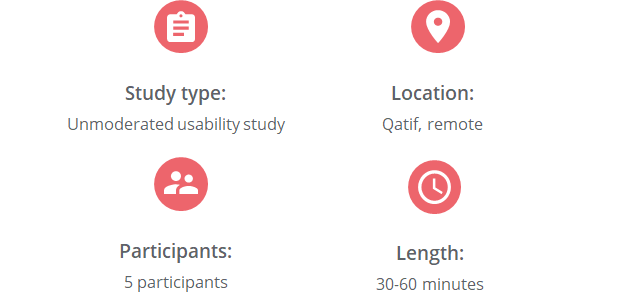
Usability study: parameters

Usability study: findings

Refining the Design
Mockups
Based on the insights from the usability studies, I applied design changes like showing a different message if there is no appointment scheduled.

Based on the insights from the usability studies, I applied design changes like showing a different message if there is no appointment scheduled.

Mockups

High-fidelity prototype
The high-fidelity prototype followed the same user flow as the low-fidelity prototype, including design changes made after the usability study.
-- View the BloodDepot high-fidelity prototype --
Accessibility considerations

Sitemap
With the app designs completed, I started work on designing the responsive website. I used the BloodDepot sitemap to guide the organizational structure of each screen’s design to ensure a cohesive and consistent experience across devices.

Responsive designs
The designs for screen size variation included mobile, tablet, and desktop. I optimized the designs to fit specific user needs of each device and screen size.

Takeaways
Impact: Users shared that the app made blood donation easier and less time consuming and it also helps in identifying any urgent need nearby. One quote from peer feedback was that “Now I have no reason not to donate blood.”
What I learned: I learned that even though the problem I was trying to solve was a big one, diligently going through each step of the design process and aligning with specific user needs helped me come up with solutions that were both feasible and useful.


Comments